There is perhaps no better measure of a place’s quality of life than how long its residents are expected to live. Life expectancy reflects a neighborhood’s safety, the quality of its health care, its environment, and the wealth and mental health of the people who live there.
With that in mind, it’s worth paying close attention to the recent drop in US life expectancy, caused primarily by an increase in drug overdoses and suicides. It suggests a decline in the country’s overall well-being in a way that economic statistics can’t gauge. But in a country with a population of 330 million people spread across 50 states, there’s plenty of room for variation in the conditions in which people live.
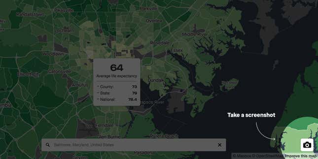
That’s why Quartz created the map below, which allows Americans to search for life expectancy in their neighborhoods. It draws on research from the Center for Disease Control (CDC), which in Sept. 2018 released what, to our knowledge, is the most detailed data on life expectancy the US ever published.
Explore life expectancy in the United States
To search for the life expectancy in a certain place, just type in an address. Hover over the result, and the map shows how the neighborhood compares to the county, state, and the country. Zoom out and see how the area compares with the rest of the region.
The data include life expectancy estimates for almost 90% of the 74,000 census tracts in the US, which typically include about 2,500 to 8,000 people. The CDC was unable to collect data from Wisconsin and Maine, so those areas of the map are missing. Other neighborhoods are missing because they had too few people of a certain age to make a calculation.
Our analysis offers insight into the inequalities that exist in the US, which go beyond the divide between rural and urban or Republican and Democrat. There are huge differences in life expectancy throughout the US—sometimes in neighborhoods that are right next to one another.
Understanding the data
The CDC’s life expectancy estimates are based on deaths in each census tract—the closest thing to a neighborhood—from 2010 to 2015. While some neighborhoods may have changed since then, particularly in places like San Francisco and New York, for the most part this remains a good estimate of how long the typical person residing in a given area might live. (For some places with a small number of deaths, the researchers used a statistical model to estimate life expectancy based on the trends in demographically similar neighborhoods.)
The researchers’ methodology suggests the estimates are usually accurate within two years of their guess. So if your neighborhood has a life expectancy of 83 years, and a neighborhood nearby has an expectancy of 85 years, there is a decent chance there isn’t really much of a difference between the two.
There are a few ways to calculate life expectancy (explained clearly here). This map shows “period life expectancy,” which is the average age at death for somebody who lived their whole life through the current conditions of the neighborhood. That means it doesn’t take into account future changes—an influx of new jobs, say, or an increase in air pollution—that could increase or decrease how long people are expected to live.
Although it is valuable measure, life expectancy at a neighborhood level has some peculiarities. The figures are based on deaths of people who are considered permanent residents. So if a hospital that provides long-term care is located in a neighborhood, that neighborhood will have unusually low life expectancy. For example, the northern part of Roosevelt Island in New York City contains a hospital providing long-term chronic care, so the life expectancy is under 60.
Also, these statistics don’t mean that you will lose 15 years from your lifespan if you move from a neighborhood with a 90-year life expectancy to one where people live for 75 years. Income and education levels are even more important factors in your personal life expectancy than the place where you live. The estimates depict the aggregate health of a neighborhood, not of individuals.
Neighbors are not always alike
At over 97 years, the highest life expectancy in the US belongs to a census tract that includes Fearington Village, a wealthy retirement community in North Carolina. (This estimate is almost certainly at least a little over-optimistic, as the rules of statistics suggest numbers at the extremes are inflated). By contrast, a bordering census tract, which includes the working-class town of Pittsboro, has a life expectancy of 79, right at the US average of 78.4.
The diverging life expectancies of these neighboring communities are not unusual. One of the most remarkable aspects of this data is just how much variation there is within small geographic areas. We found that there are 20 bordering census tracts where the difference in life expectancy is 20 years or more. Often these neighboring tracts are separated by physical barrier like a river or highway, while others are separated by historic racial lines. They are dispersed across every region of the country.
We examined two neighboring tracts that were among the most disparate in terms of life expectancies.
Highway 94 and life expectancy in Minnesota
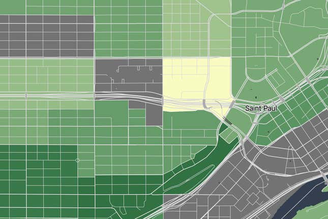
Just to the west of downtown St. Paul, Minnesota, lies one of the worst-off neighborhoods in the state. The neighborhood, which is in the eastern part of St. Paul’s Rondo area, has a life expectancy estimate of about 65 years. Over half of the tract’s nearly 1,500 residents live in poverty. Almost 50% are black, 13% are Asian, and 12% Hispanic, with the rest white or multiracial. Less than 10% of the adults have a bachelor’s degree.
But walk for just 15 minutes southeast over the I-94 highway, and you are in a very different world. In the southern part of the Historic Hill neighborhood, filled with massive Victorian houses, nearly 70% of residents have a college degree, and almost 30% have a graduate degree. Eight-five percent of the area’s almost 3,000 residents are white. The life expectancy is 86.
The two neighborhoods have long been demographically distinct. The poorer neighborhood, a part of East Rondo sometimes called Cornmeal Valley, was home to much of St. Paul’s low-income black population in the early 20th century. Many of the residents worked for the railroads as traveling porters. The wealthier Cathedral Hill neighborhood, meanwhile, was home to some of the city’s wealthiest white population. In these grand 1880s era homes, they were attracted by the short distance from the downtown area and grand views.
The neighborhoods differed, but they both once shared close-knit communities, according to the geographer Bill Lindeke, a specialist in the history of Minneapolis-St. Paul. Although Cornmeal Valley was poor, it was an area rich with institutions, like churches, social centers, and clubs.
Then came the highway.
In the 1950s, the US Department of Transportation built the I-94 freeway to connect Minneapolis and St. Paul. Although the freeway could have been built north of the city through abandoned train tracks, the government chose to build it in the center of the city, cutting right through the historically black Rondo neighborhood that contained Cornmeal Valley.
The construction of I-94 is a rupture in the area’s history, Lindeke told Quartz. In order to make room for the highway, the city bulldozed homes in Cornmeal Valley, and many of the people who were displaced never returned. Those who did stay faced a noisier, more polluted area that was separated from the wealthier southern part of the city.
Lindeke’s research also suggests that the post-highway design of the streets led to more traffic. This meant that fewer people spent time together outside, which was bad for safety and for the area’s sense of community. In addition to the lower income of the neighborhood’s residents, all of these factors are likely contributors to the area’s low life expectancy.
The highway’s damage can’t be undone today, but it could be mitigated. Redevelopment efforts include attempts to cover some of the highway just west of the area with a land bridge.
The ill health of coal mining West Virginia
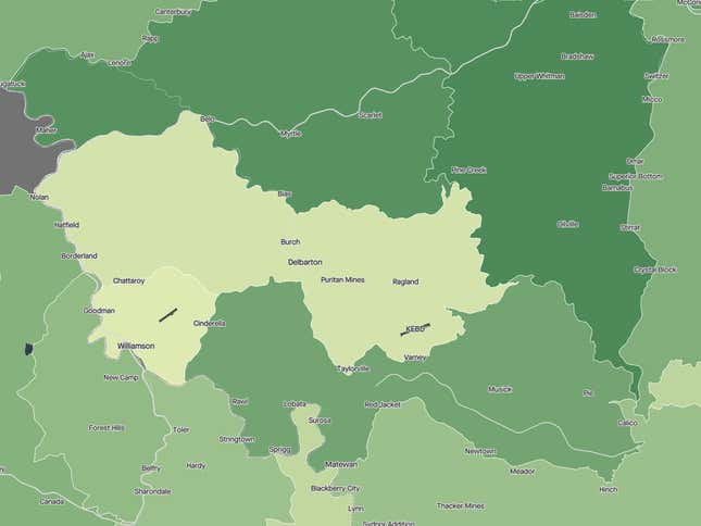
Mingo County, West Virginia, is in the heart of coal country. The area was buzzing in the mid-20th century, the height of coal extraction in the area, with the county’s population reaching almost 50,000 people in 1950.
The area’s population is half as large today. Though it is still among the top coal-producing counties in the country (pdf), new technology means that the industry needs fewer workers. Today, the average census tract in the county has a life expectancy of 74, placing it in the bottom 10% of US counties.
Public-health scientist Michael Hendryx, who has spent over a decade studying health in southern West Virginia, told Quartz there is no single reason for the low life expectancy of people in Mingo. The median household income in the area is just over $31,000. Mingo also has high rates of obesity, cigarette smoking, and opioid abuse. As Quartz’s Gwynn Guilford has written, the area’s over-reliance on the coal industry, and lack of investments to diversify the economy, played a role in its current destitution.
Although it is less clear-cut, another likely factor in Mingo’s lower life expectancy is mountaintop removal—a form of mining that involves using explosives to blow off the top of mountains to gain access to coal. This process is known to release toxic chemicals and minerals into the environment. Hendryx’s research finds that these pollutants lead to higher rates of cancer (paywall) in coal country, as well as heart, lung, and kidney diseases.
His analysis suggests that areas with mountaintop removal like southern West Virginia have around one additional death per 1,000 people each year. The intensity of mountaintop removal could heighten or lower this effect. Mingo County is among the areas with the most intense mountaintop removal, and its air and water have almost certainly been affected.
Yet even inside Mingo County, there is a great deal of variation. The census tract that contains the town of Williamson has a life expectancy of just 67 years. Just to the east, the census tract containing the town of Matewan has an average life expectancy of 77. Socioeconomics explain much of the difference between tracts, but not everything. The number of local stories is too vast for any two reporters to take on. We need help.
Explain your area to us
Since we can’t report out every story, we hope that as you go through the map, you will share what you know. For areas you are familiar with, if you spot two neighboring census tracts with a big gap in life expectancy, take a screenshot using the option in the bottom righthand corner of the map. Then tweet or instagram the image and tag @qzthings, explaining to us any context that you might have about why two nearby areas could have such divergent estimates.
At the bottom of this article, we will feature our favorite social media posts that come from the map. So come back to check in on what readers have found.